Team Similarity Tool
“No matter how good you are, you’re going to lose one-third of your games. No matter how bad you are, you’re going to win one-third of your games. It’s the other third that makes the difference.”
– Tommy Lasorda, Pitcher, manager, and Hall of Fame inductee
Our team similarity tool started as an idea to expand on player similarity scoring to better understand team rankings and possibly predict team performance. The effort was not as successful as we would have liked.
What’s a baseball team?
The first challenge was deciding what a team actually is.
MLB has several team concepts including a 40-man roster consisting of everyone signed to a team and a 25-man roster consisting of active players who typically travel with the team. Even these concepts don’t necessarily capture who is active on the team and there are differences between National and American leagues, notably the designated hitter.
After some debate, we decided to use a model of the team based on starters and most active players. Specifically, we choose:
- Eight Fielders: Those with the most game starts for each fielding position
- Seven Pitchers: Five pitchers with the most starts in a season, one closing reliver with the largest number of games saved, and one middle reliever with the greatest number of innings played who is not a starter or closer.
- One Extra Hitter: For American league teams, this is the designated hitter. For National League teams, this is the batter with most at bats that was not included above.
We believe these players would have the most impact on a team’s performance.
Modeling Team Similarity
To model team similarity, we represent each team as a vector. We tried several models for comparing teams.
Player-to-Player Using James’ Similarity
For each player in a position, we calculate the James player similarity score against the player in the same position in the comparison team. That is, we compare the first baseman to the first baseman, second baseman to second baseman, etc. We create a single vector of the scores.
Player-to-All Players Single Value Model
For each player on the exemplar team, we compare that player to every player on the comparison team. (Note that we only compare fielders to fielders and pitchers to pitchers per the James’ model.) This results in a set of vectors for each player. We then average the vectors to get a single value result.
Player Statistics Cosine Similarity
For each player in each team, create a vector of available player statistics and compare the vectors using cosine similarity.
Statistics for batters are games played, at bats, runs scored, singles, doubles, triples, home runs, runs batted in (RBI), walks, strikeouts, batting average, and slugging percentage (total bases divided by at bats).
Statistics for pitchers are wins, losses, win-loss percentage, earned run average (ERA), games played, games started, games finished, saves, innings pitched, hits allowed, strikeouts, bases on balls (walks), and shutouts.
We use the statistics for each player for just the season in question since past performance for an individual player may not be related to current performance. This approach also appears to control for the age of players.
Models plus Team Statistics
For each of the above models, we created new models by adding team statistics including win percentage, home game win percentage, away game win percentage, runs scored, and runs allowed.
Team Similarity Results
We looked at several sets of teams, including all the teams from 2010. The best record that year was held by the Philadelphia Phillies with a win percentage of .599. The worst record was the Pittsburgh Pirates with a record of win percentage .352.
When using the player-to-player and player-to-all-player single value models, we get:
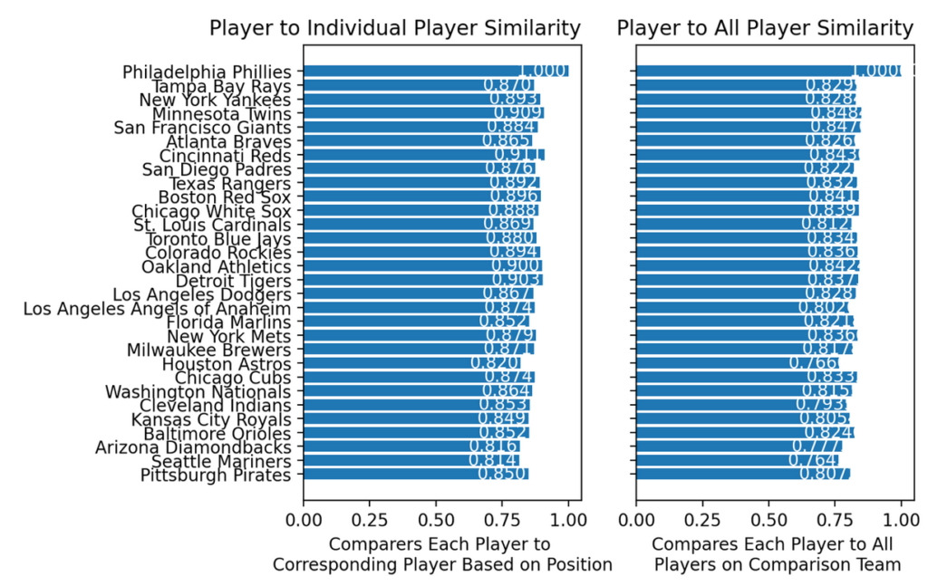
Note the gap between the best and worst team is not the largest gap in similarities. The largest dissimilarity form the Phillies is actually the Houston Astros with a win loss percentage of .469.
Using the same models but adding in team statistics yields:
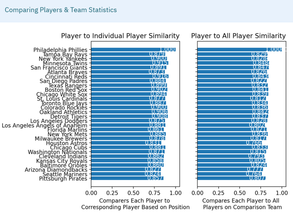
Again, the expected largest gap is not there. The largest dissimilarity in the player-to-player model is with the Arizona Diamondbacks who had a .401 win-loss percentage and finished at the bottom of the NL West.
Notice that the player-to-all-player model remains the same. In both models, the addition of team statistics is narrowing the range of returned scores probably accounted for by the much smaller number of team statistics in use (particularly compared to the player-to-all-player models).
The player-to-all-player cosine similarity model did not show extreme difference between teams either. We used a pairwise comparison of these teams and found similar results.
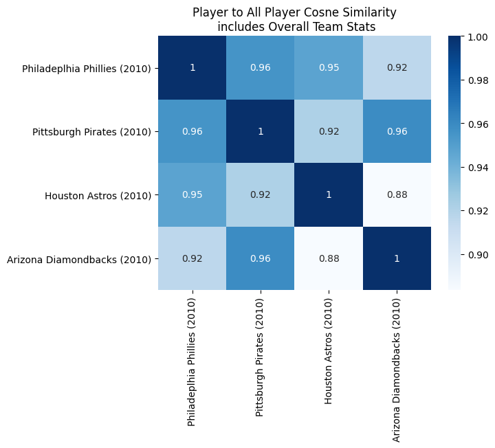
These results show that the models used are not well correlated to overall team standings and more sophisticated models are required. (We’ll discuss more below).
It seems Tommy Lasorda was right all along.
What’s next?
For the Team Similarity Tool, more work on the model to improve it and hopefully create some predictive power.
For you the loyal reader and baseball stats junkie, check out this brief post on how to access the BaseballML.com data.